Logotype and illustrative icons and marks for fiber artist and teacher, Natalie Ebaugh
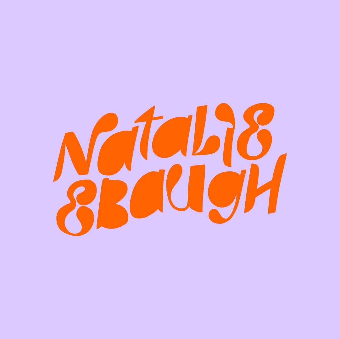

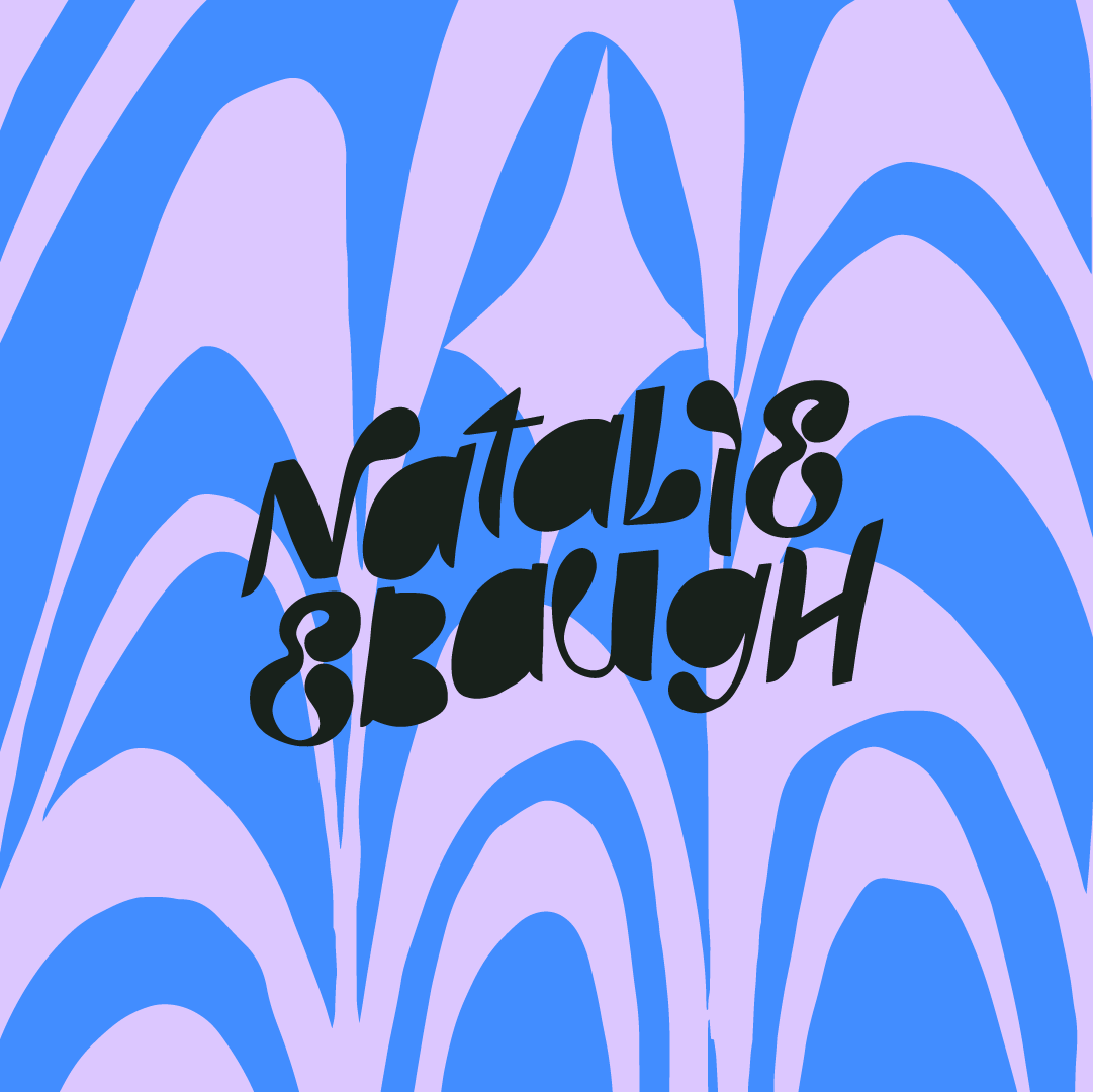
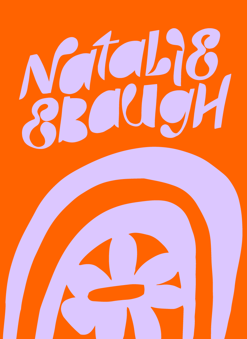
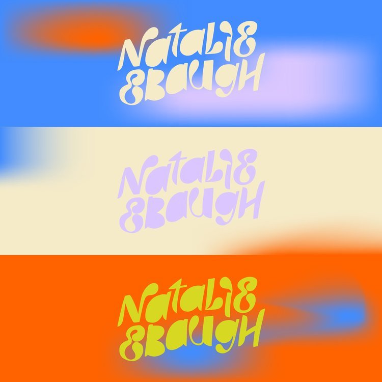
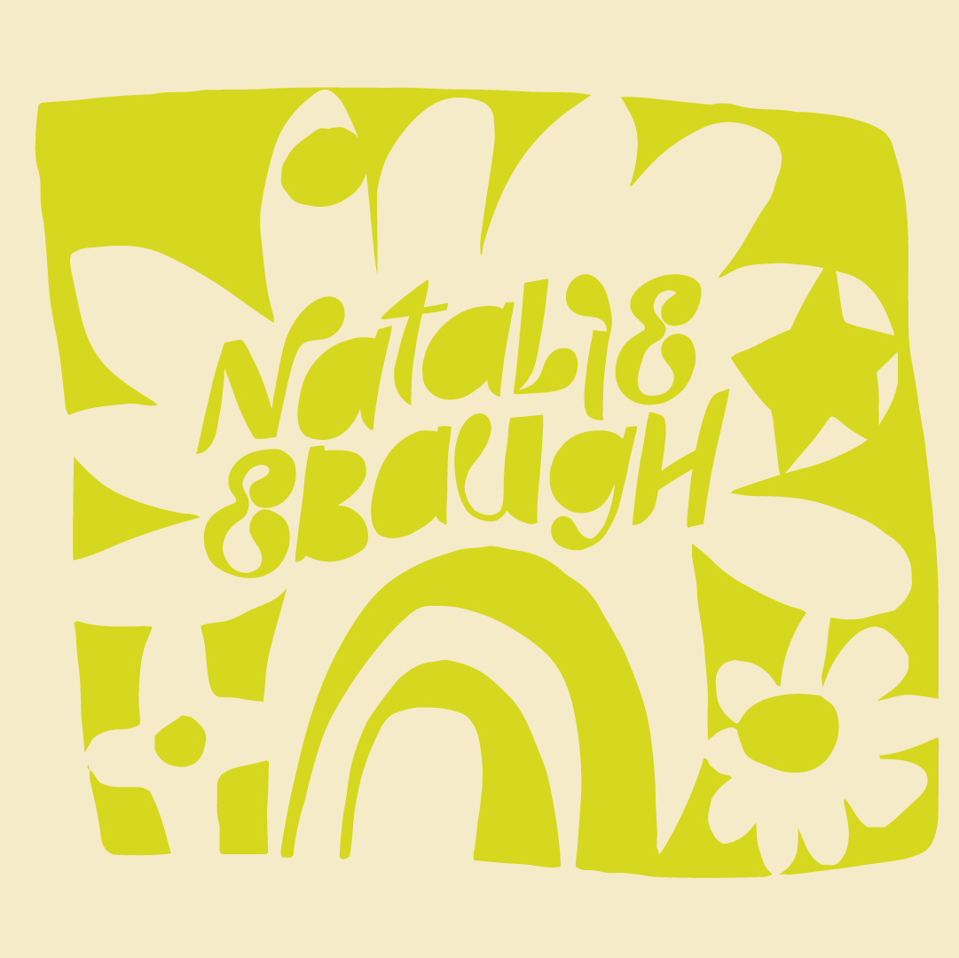
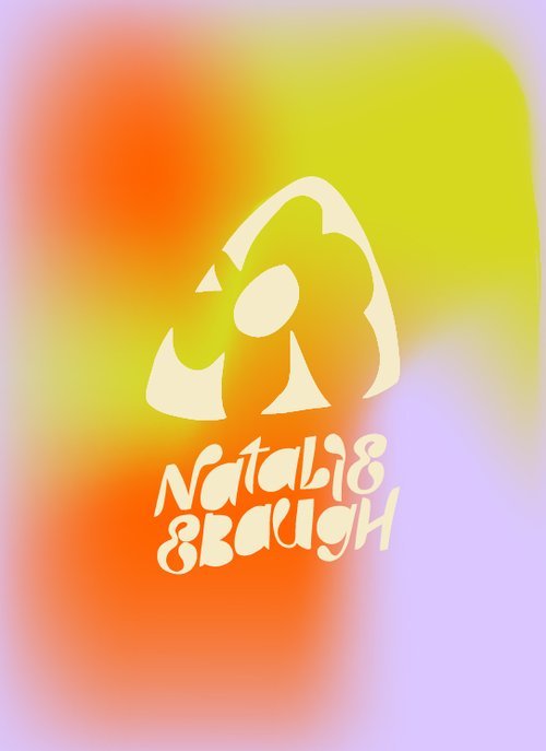
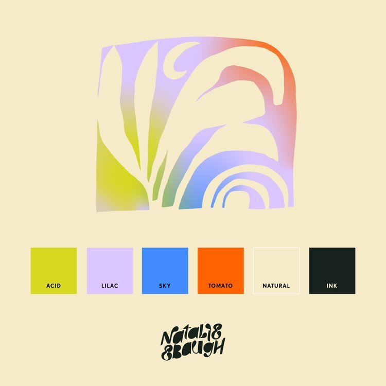
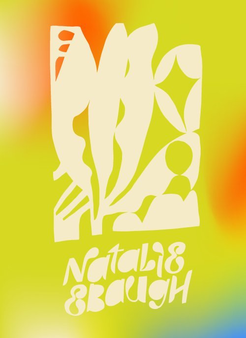

Natalie and I started this project with some keywords: dreamy, acid, drippy, trippy, psychedelic, and organic. And, from there it was a big exploration in colors and patterns that represented Natalie’s quilting and textile work in an exciting and dreamy way.
Finding a color palette that was bright and crazy but also could meet Natalie and her work in softer moments was a treat. The pastel and acid contrast is something I admire in her artistry.
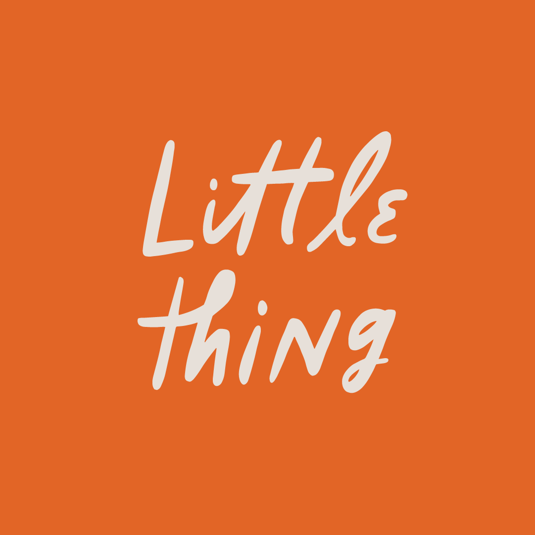
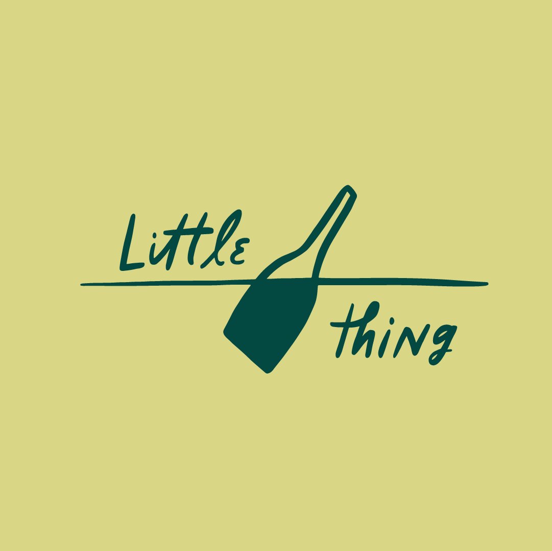
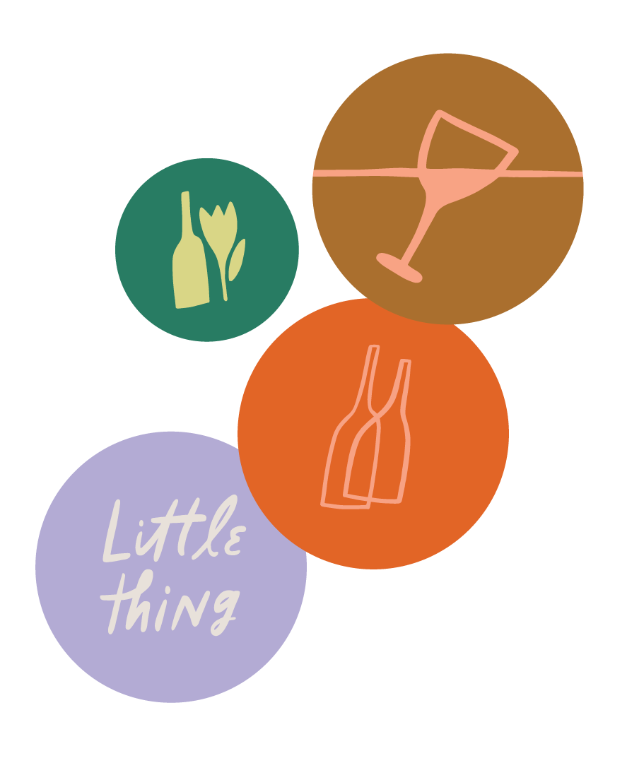
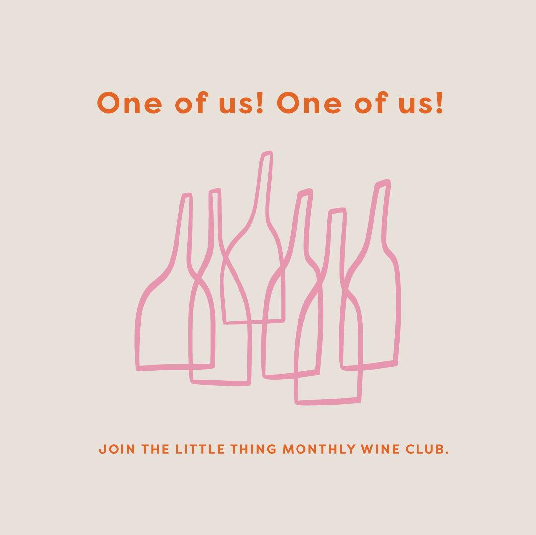
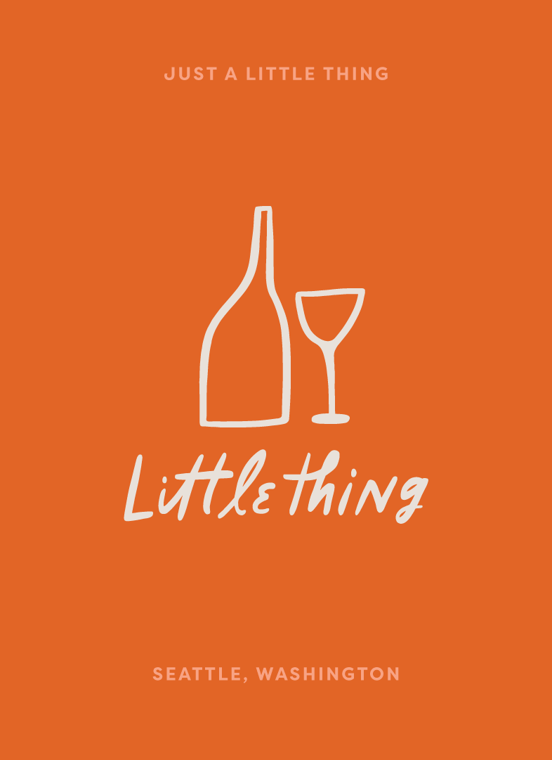
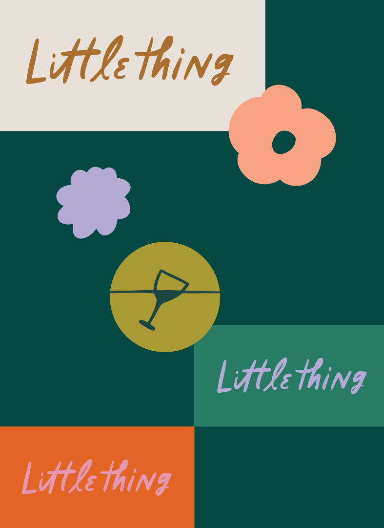
Branding and direction for Little Thing, a curated wine club and shop in Seattle
Collaborating with co-owner Dylan to create branding for Little Thing started off amazingly organic, with talks of how a curated selection of wine really creates more opportunity than a shop bursting at the seams; Little Thing will curate 12 wines monthly, changing with seasons and occasion.
We talked about the vibrant PNW and how that related to wine and Little Thing’s mission of educating and breaking down any stuffy wine snobbery.


Identity and branding for social-enterprise The Pastry Project
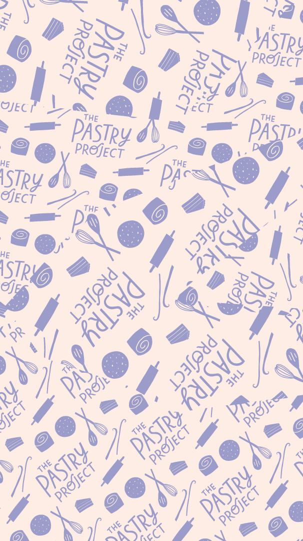
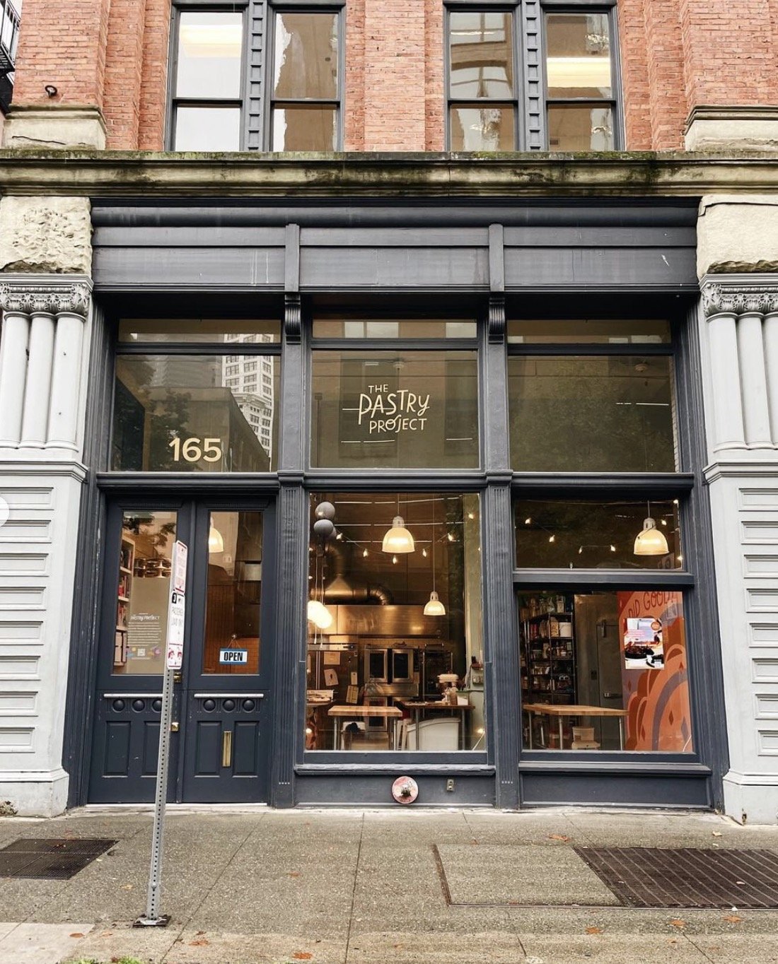
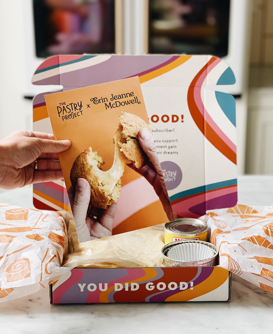

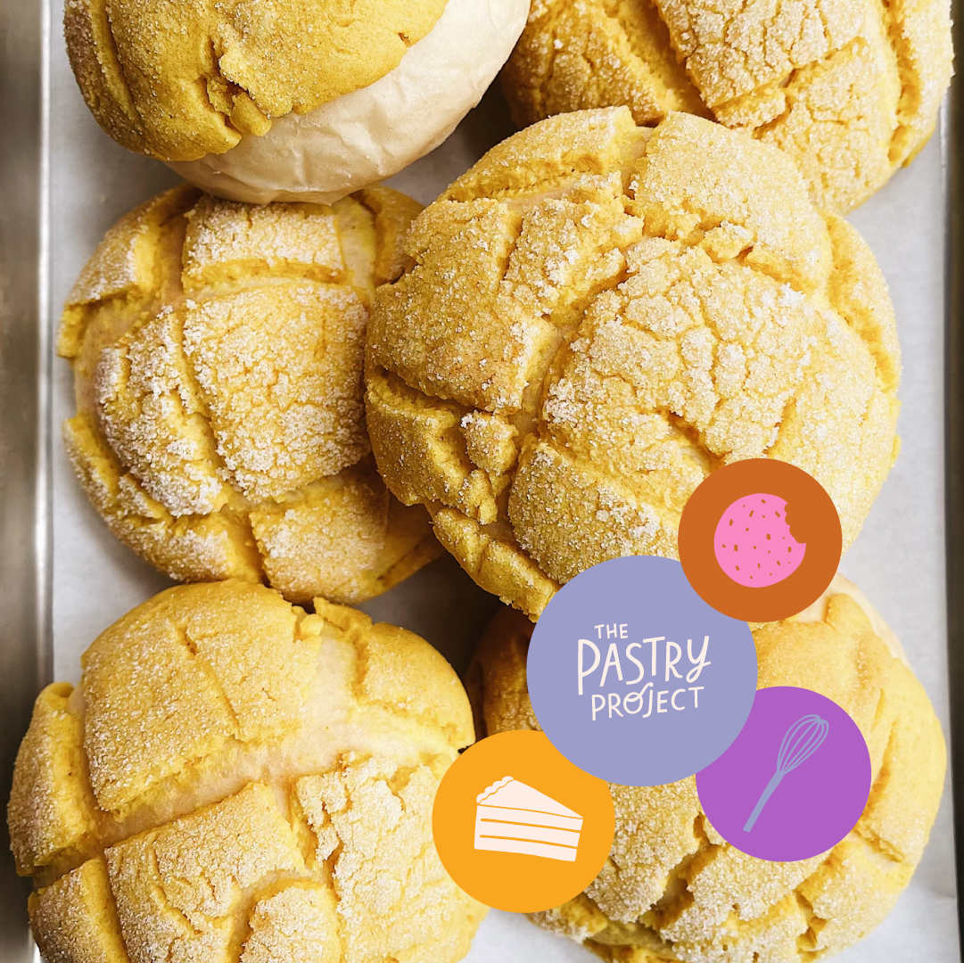
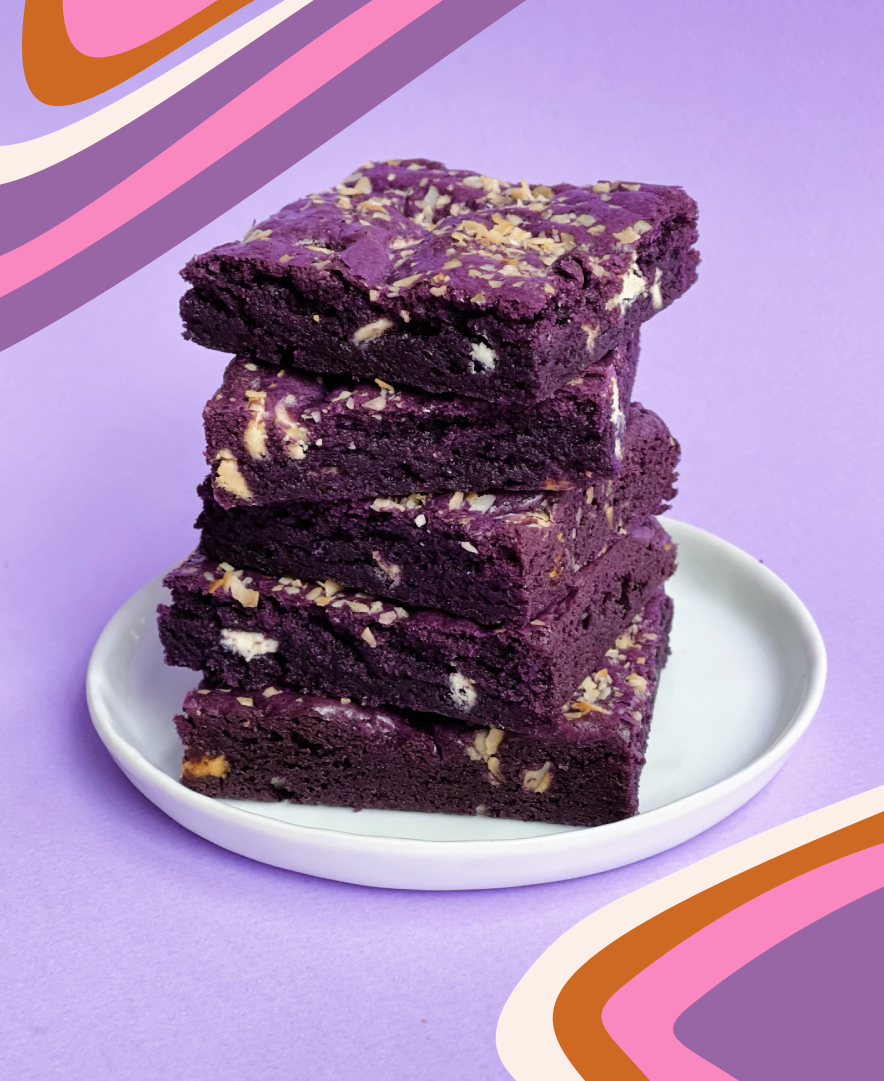
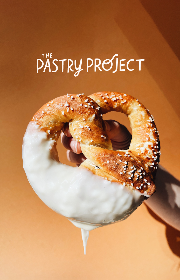
When Heather and Emily approached me about creating an identity for their new organization, The Pastry Project, I had no idea it would grow into such a lasting a collaborative partnership.
Since its opening of a community kitchen, to hosting classes to the public, developing and marketing take and bake cookie dough, to the infamous Soft Serve Summer pop-up, the work has represented the brightness and optimism of The Pastry Project.